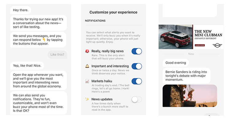
Quartz released their iPhone news app this week! Because of recent design projects, I’ve tried to become a student of other app designs, particularly news apps. This one struck for its unique take on news. Here are some of the takeaways from Quartz’ take on news on the mini screen.

- Start a conversation.
The app uses a “conversational UI” that feels like a text conversation with a friend. The informal language, animated GIFs and emojis keep you interested and curious about what’s coming next. - Tell them when they need to know, when they need it.
Rather than present a list of all the headlines, the Quartz app offers one story at a time. The heavily-curated stream lends itself to checking in during the in-between moments in a user’s day. - Focus on storytelling.
The design of the app is invisible (only two screens), which amplifies the news narrative that’s being presented. - Make them smile.
I don’t care about the daily stock market reports, but I just had to sign up for the daily “Market Haiku” notification, which hasn’t disappointed me yet. - Have an opinion.
Rather than create a news app to match all the others, the Quartz team took a stand by saying “this is how news should be consumed on your iPhone” (Basecamp would approve). - Send people away.
Much like their Daily Brief email, the Quartz app provides headlines with links to articles from anywhere, not only the ones that live on their website. In the same way that Google became a trusted resource for how they send people out of their ecosystem from their search engine, Quartz points users to the across across the internet, hoping you’ll come back for more. - Cross-pollinate for new ideas.
You can imagine how the brainstorms for this app idea went: “What if news was more like texting?” “How do friends talk about news?” Quartz focused on making an native iPhone news app, which stands out in a crowded App Store category. - Focus on the user.
From the outset the app aims to be your friend by offering non-intrusive notifications and asking your input about every news story highlighted. - Make ads part of the design.
The consideration of ads is an evident part of app design. Often app mockups have a placeholder box saying “ad”. This blank box says, “We don’t want to deal with the advertising, but this is where it will live, I guess”. The Quartz app offers unobtrusive ads that are integrated into the text stream.
Make sure you check out the app. And sign up for the Market Haikus, I’m telling you…