Young kids have a way of maximizing whitespace when they’re colouring. Three marks on a paper can be a completed work of art that deserves a place on the crowded fridge.
As they get older they learn to fill the page with colour (to the gratitude of many a parent, and many trees). They start to learn that you need to fill the page before you can call it complete.
When I look at my schedule, I wonder if I’ve picked up a habit of filling the whitespace. I tend to think that my day isn’t complete unless I’ve filled every inch with activity, from the time I get up to the time I hit the hay.
Does your day ever look similar?
Design can be a great metaphor for life (which is why there’s a book about it, I suppose). Designs with whitespace are better because they have focus. They draw the eye, reduce clutter, and make the main point stand out to its viewers.
In the same way, I wonder whether a day with more whitespace also is better. Would larger margins between events, more time to catch your breath, make your day more focused? By removing some of the clutter, would the main point of your day (and, as a result, your life) also stand out more?
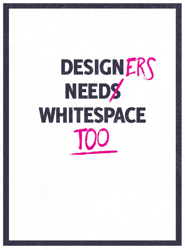
Chris Barkman’s poster about whitespace is a great reminder, not only for designers, but anyone who wants to design a good life (and it’s from his 365 poster project, make sure you check it out):
If your days are feeling cluttered, try increasing some of the margins. Take the scenic route. Take an extra-long sip of your morning coffee. The whitespace might add focus and meaning to your entire day.
Wow, maybe those young three-lines-on-a-page kids are onto something…
