Here’s one of my favourite comics from The Far Side.
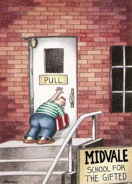
This comic’s clever because even the most “gifted” of us know what it feels like to be humiliated by a simple door.
Doors offer fascinating examples of interaction design. Most doors go completely unnoticed, precisely because of their good design. Over hundreds of years of walking through doors, our culture has a pretty well-defined interaction language that signified how to operate a door. Most door designs have become so intuitive that push, pull or slide them without even thinking.
It’s those poorly-designed doors that catch our attention, and make us feel less than “gifted”. And they’re everywhere.
Doors in the Office
Here’s a door that has confounded many a gifted co-worker at my workplace.
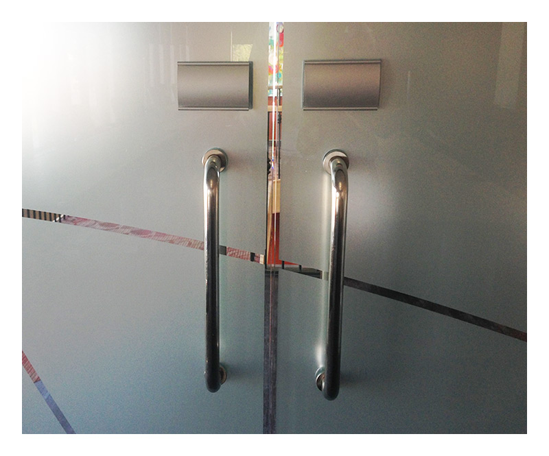
These doors, with the vertical handles that are perfectly designed for grabbing with your hand and pulling towards you, are misleading because you must in fact push these doors to open them.
After seeing countless gifted colleagues dislocate their shoulders trying to pull on these doors, I decided to help everyone out. While Scott Klemmer would be quick to point out that signs and things like Post-It notes are a good indicator of a flawed design, but I thought a quick adjustment might help:
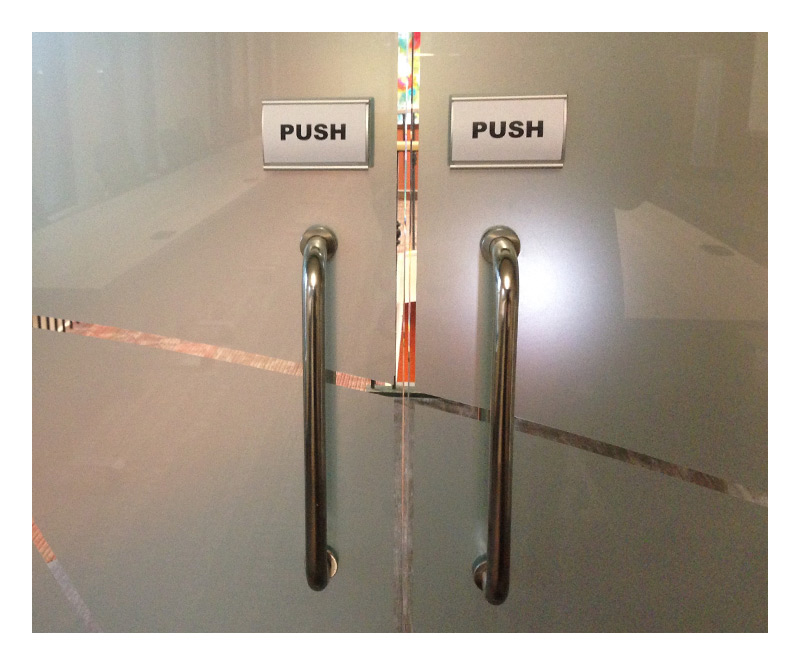
Did these help tips make a difference?
Surprisingly, after a few weeks with these new helpful signs, people are still instinctively pulling these doors, before kicking themselves and pushing the door open. Much like writing the word red in the colour green, the sign only serves to confuse everyone and highlight the absence of good design.
“The design of the door should indicate how to work it without any need for signs, certainly without any need for trial and error.” – Don Norman
Designing for Humans
Doors like these have been coined “Norman doors”, after author of The Design of Everyday Things Don Norman, who pointed out this common design flaw.
The “Norman door” dilemma can be seen in the design of many other everyday items, and even more so in the design of software and website interactions. Interestingly, many people, when they encounter a poorly-designed website or form, blame themselves, saying they’re “not very good with computers”. And while it’s convenient for designers to blame design flaws on a user’s ignorance, designing for humans means we need to strive to make our (to quote Norman) “machines understand humans”, rather than forcing users to understand the machines.
Maybe it’s reasonable to expect users to have some kind of domain knowledge and accurate conceptual models to operate a complex machine like a computer. But that expectation diminishing more by the day. As computer technology continues its migration from the engineers’ computer labs to the pockets of everyone, computers are quickly becoming “everyday items”. Items that, just like doors, have their own design vocabulary. This design vocabulary includes colours, shapes, structure of information, and increasingly even touches.
As Alex Castellarnau of Dropbox points out, “We are just in the infancy of designing a whole language around gestures.”
We are increasingly understanding sites and app behaviour by intuitive “feel”, rather than putting up with help text and other digital Post-Its.
Well-designed doors are good because they understand human behaviour. Can we, similarly, make interfaces that understand the intuition of ordinary humans?